
We’re writing the next chapter of the Broadside story with a new design for our Paso Robles Cabernet Sauvignon!
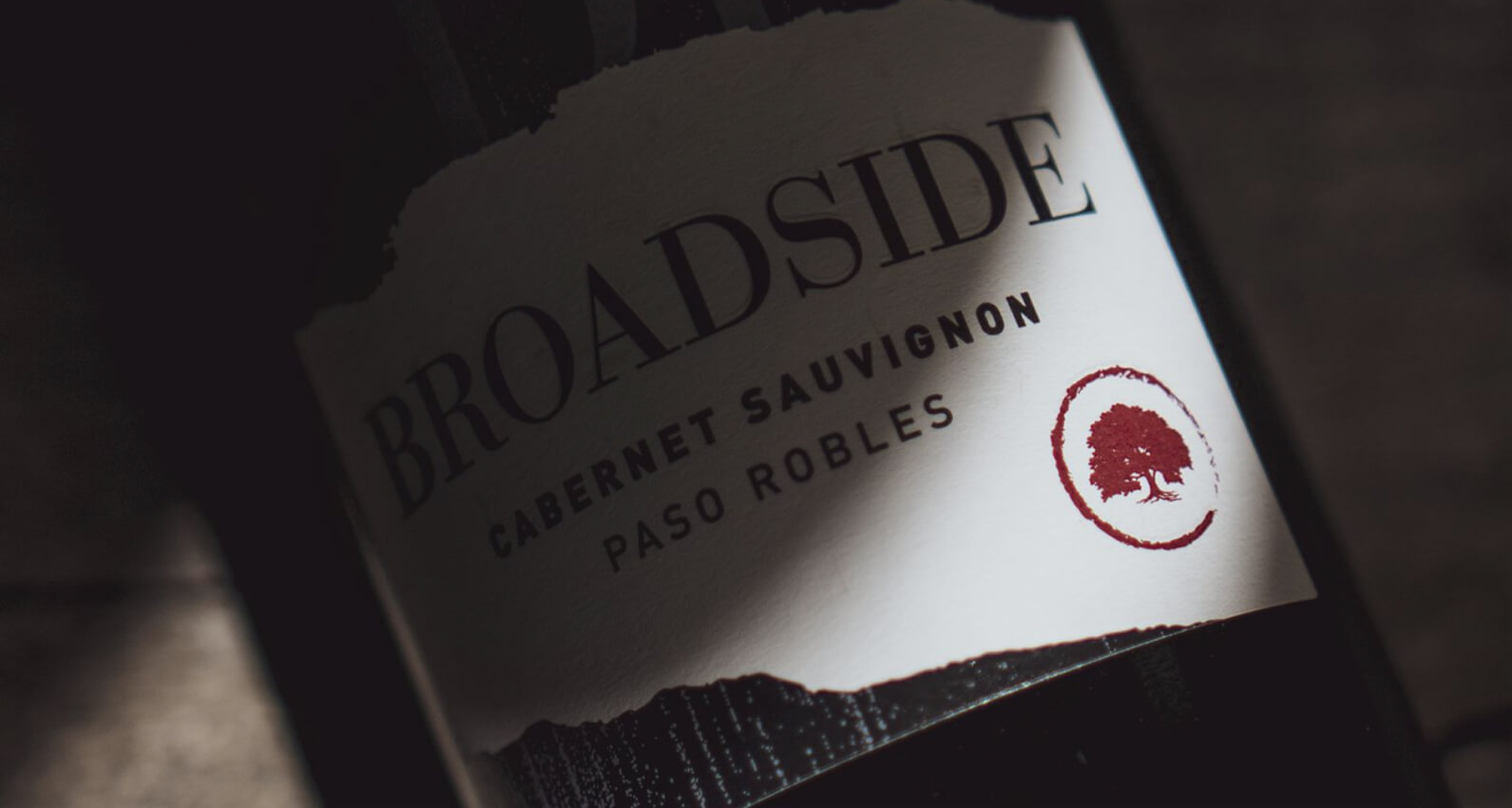
Each element of the new package was carefully developed to reflect the pioneering spirit of Paso Robles and our brand heritage. The front label incorporates elements from our flagship Blackletter Cabernet Sauvignon, integrating our original logo into a sleek greyscale design. The focal point is the horizontal logo on a parchment-style setting, emblazoned with an oak tree icon – a nod to the “Pass of the Oaks” (the translation of Paso Robles), where our partner vineyards are home to towering oak trees that date back centuries.
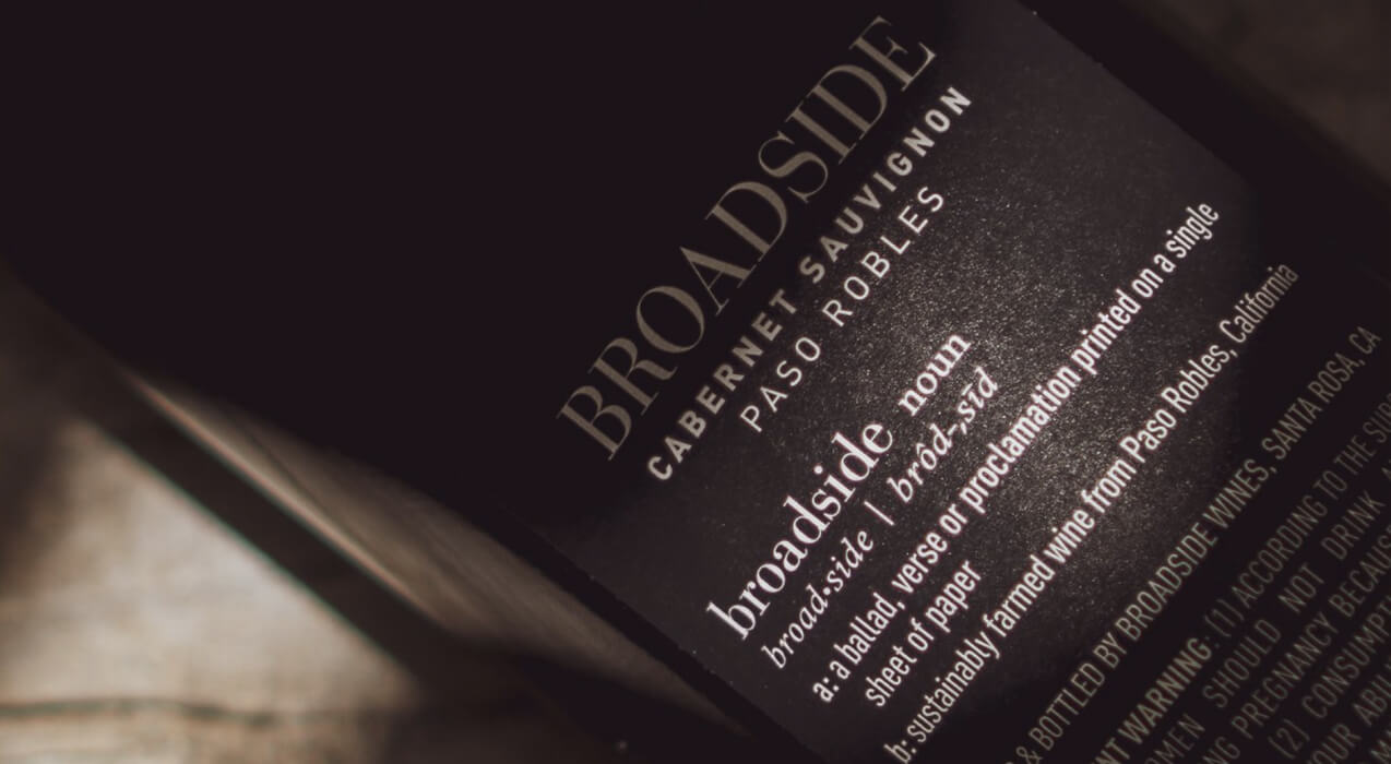
The back label highlights our sustainably farmed vineyard sources, as well as the literary origins of our name. The bottle is topped with a new matte red capsule, adding a subtle dash of color. Our corks are with the Broadside logo and are produced from sustainably sourced plant-based materials that are 100% recyclable.
We are thrilled to share this design and look forward to seeing the new package in market!